Visualization Tools Overview
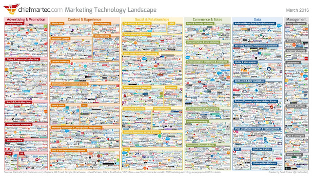
The above image is a list of 'a handful' of companies working in the Marketing Technology space. Only about 8% of them are very large, but as you will notice, a slew of them are in Data. Within Data, there are always new niche players coming up with neat visualizations tools. However, I will address just a few of the large players today.
TABLEAU
Much has been said about the benefits of Tableau as a data visualization tool, particularly for large datasets. It is certainly a wonderful software once you learn to use it, the drag and drop interface makes it super easy to handle. Unlike basic Excel, Tableau can work with extremely large amounts of data, and can analyze that data very quickly into highly interactive graphs, charts, and geographic visualizations. The availability of heat mapping and color coding to illustrate vast amounts of data across a geography is perhaps one of my favorite features.
Notably, Tableau doesn't work with unstructured data well, as other services like SAS will. Tableau requires data to be structured and cleaned before being imported, one of the more significant learnings our instructor sought to drive home during the course. For users this means that for every cell of data in an excel file that is imported, there should be data in it, and in the right format, either numbers, booleans, text, etc. This can require a lot of advance work and and Tableau should by no means be considered a way to avoid using excel nor its does its drag and drop functionality make it peanut butter and jelly easy. Marketers wishing to work with this service must get comfortable working with data, combing through it, and analyzing whether what you are producing in Tableau suggests the data is being accurately interpreted. Tableau is fantastic, and clearly an industry leading resource, but still has a long way to go. Sequential drag and dropping is one of my pet peeves, where Tableau becomes more confusing than it needs to be. For reasons I don't completely understand, the software requires a certain sequence of action when dragging and dropping, which can cause real problems for a novice user. For instance, having to drag to the one axis before the the other (depending on the type of chart), and then performing all the following sub-steps in an unknown set order to tease out subcategories or get a chart tool to work properly, can be befundling if you know you're checking the right boxes, but not getting the right result. Tableau would benefit from a Google Analytics prompt-style tutorial built in that asks what you are trying to do, and then directs you through which sequence to pull things in. Right now, if you select your criteria in a sequence the software designers didn't anticipate it can trigger an error.
SAS
Data analysis with SAS is a bit different. SAS can work with unstructured data, but the data still has to be properly labelled as a number, boolean, or text, and knowing your data so that you can filter out extraneous content can be integral to simplifying the process. SAS is a tool that focuses on pattern recognition whether that be finding causation or correlation. Marketers might use it for shopping basket analysis and consumer segmentation. Data Scientists might use it for machine learning, neural networks, and AI to understand user behavior or understand sequential actions in order to build better user experience systems. Tableau might be used, instead, to summarize the results of what SAS finds, but can't do the heavy lifting on top of the layout. The visualization tools SAS has tend to be limited to classical line graphs and charts.
GOOGLE ANALYTICS
Google Analytics has numerous data visualization tools and reports that help businesses understand their online marketing activities. Many are interactive, can be real-time, or they can be built into dashboards and reports. It includes a variety of metrics about the consumer audience, their demographics, their behavior in connection with a campaign or website, the site's e-commerce and conversation rates, the success of conversion at various points in the process. Again, its specific to the business's online performance, and doesn't any of the business outside that scope.
To learn more about Visualization Tools, check out these blogs:
https://carlofiore.blogspot.com/2017/05/tableau-around-classroom.html
http://discussinganalytics.blogspot.com/2017/04/data-visualization-and-reporting.html

Comments
Post a Comment